Get Back to Nature with Earthy and Elegant Interior Paint Colors
Presented by Williams Lumber & Home Centers | Spring 2025 | Design Feature | Home Improvement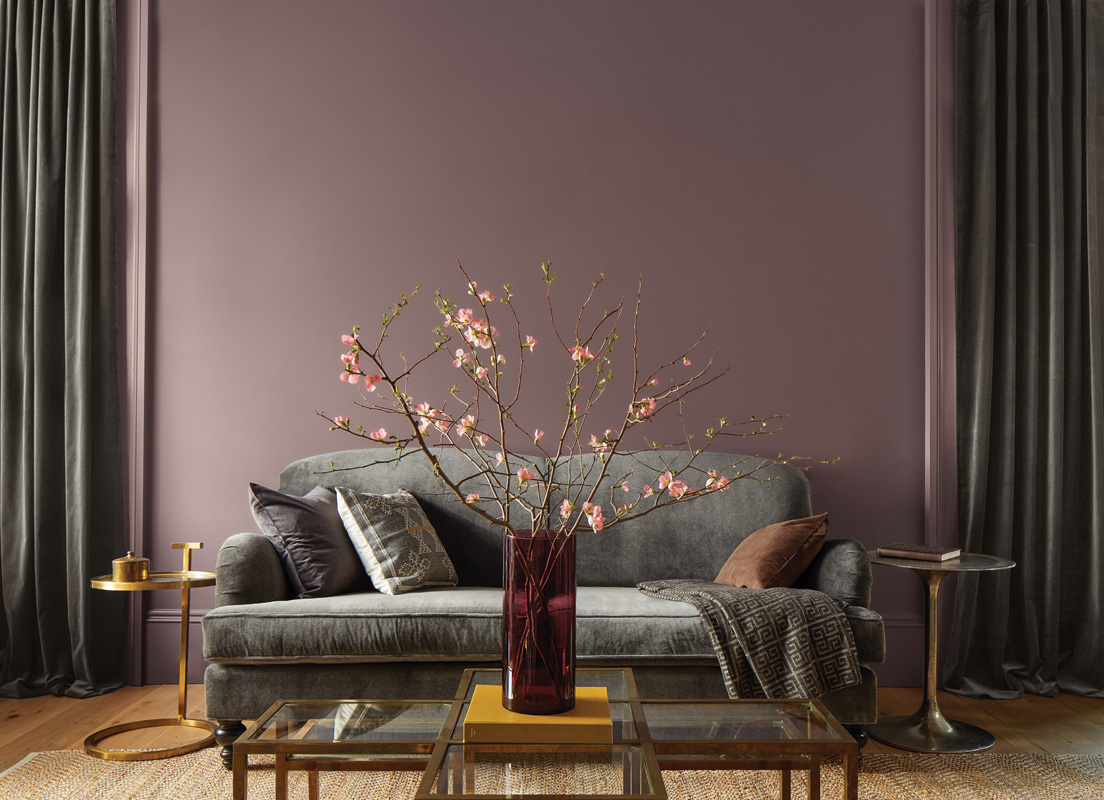
When seeking to refresh a space with color, look no further than the landscape of the Hudson Valley. The region, rich with rolling hills, coursing waterways, and verdant forests, offers an endless source of inspiration for interior design. Bringing naturally occurring hues indoors, designers and DIY-ers can create spaces that feel enlivened and connected to their surroundings.
“You deserve a space where you can relax and unwind, where tranquility greets you as soon as you walk through the door. The Benjamin Moore 2025 Color Trends can help you do just that,” explains Kim Williams, Senior Vice President of Retail Operations at Williams Lumber and Home Centers, the go-to name for home improvement in the Hudson Valley since 1946 and an authorized Benjamin Moore Dealer.
Among the standout hues for the year’s Benjamin Moore palette is the color of the year, Cinnamon Slate—a grounding shade with a soft sophistication (pictured above). This versatile color, reminiscent of the region’s rich earth, is equal parts plum and bark, making an inviting atmosphere whether used as a dominant wall color or as an accent.
This color works beautifully on walls, creating a cozy yet classy environment. Pairing it with neutral furnishings allows it to take center stage, while incorporating natural materials like reclaimed wood or stone enhances its warmth. Cinnamon Slate can be used on cabinetry for a bold-yet-refined look. It pairs well with warm-toned metals, such as brass, adding an elegant touch. As a wall or accent color, it fosters a sense of calm and relaxation, making it ideal for a home retreat. Cinnamon Slate’s versatility means it can be incorporated into a variety of aesthetics, from modern minimalism to rustic charm, making it appealing for Hudson Valley locals looking to embrace the beauty of their region.
A Peaceful Yet Refined Palette
Anyone could benefit from a few more deep exhales in their day. This year’s palette includes 10 landscape-inspired colors, extending the calm of a Catskills drive into the home.
The palette of the year reflects the serene scenery. “One of my favorite things about living in the Hudson Valley is being surrounded by so much natural beauty and storied history. This palette feels like an extension of that—perfect for creating spaces that blend modern design with timeless charm,” says Williams.
Whether used individually or together, these colors create interiors that feel warm and inviting. Tissue Pink creates a comforting kitchen, bedroom, or bathroom wall that balances homey and tasteful features. It’s just enough of a pop of pink to add beloved modern brightness while still maintaining elegance.
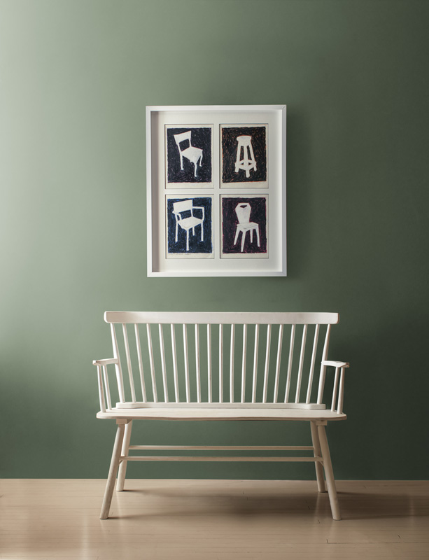
Rosepine creates a refined aesthetic set behind a white entryway bench.
Sea Salt and Paris Rain are versatile and neutral shades. When used as wall colors, they balance boldly colored furnishings like the graphite-green of ashwood moss, or the mesmerizing teal of stained glass.
Looking for greener still? An ultimate homage to the Hudson Valley’s woodlands is Rosepine, a deep green wonder that creates depth in a room. Announce a space by using it as a wall color or to make shelves and cabinets evoke the forest. Leather Saddle Brown is inspired by the texture and warmth of aged leather, creating a rooted feeling, adding to the sentiment that home should feel like someone’s anchor.
Putting the Pedal to the Palette
Some paint palettes can leave people unsure as to which colors pair nicely with one another. “The beauty of this palette is how these colors work together seamlessly,” Williams says.
Whether side-by-side as wall colors in a single room, or switching colors throughout a home, the individual hues create a musical medley when together or carry a strong serenade solo.
The magic of this year’s scheme is that there is no wrong way to use these colors. However, there are a few ways that can further enhance tones and atmosphere. Natural light can influence how a color looks and testing with samples can help someone astutely observe these shifts throughout the day. “A hue that looks soft and muted in the morning light may take on a richer tone by evening,” Williams says.
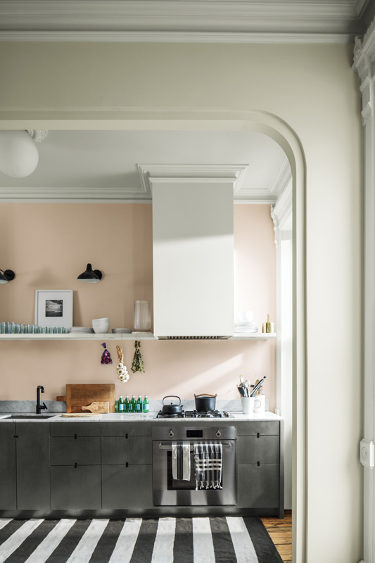
Tissue Pink adds warmth and modern sensibility to a kitchen.
Cozy textiles work harmoniously with this palette. “Whether it’s woven rugs, linen drapes, or reclaimed wood accents, combining organic elements with the 2025 color palette will enhance the natural charm of your space,” Williams says.
Strategically using bolds can help a rich color make a room pop without being overbearing. Pairing them with neutrals, like glacier white, can create this balance. One can opt to use bolds on cabinetry or accent walls.
By drawing inspiration from the landscapes that make the Hudson Valley so beloved, those seeking to enliven interiors can not only refresh their spaces but also celebrate home. “These hues create a harmonious balance between home and the great outdoors, creating spaces that feel both grounded and timeless,” Williams says.