To Trend or Not to Trend: How to Pick Your New Paint Colors
Presented by Williams Lumber & Home Centers | Winter 2019 | SPONSORED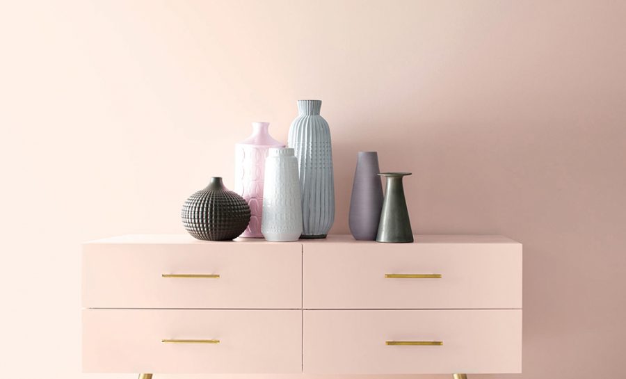
Midway through the 20th century, bathrooms around the world got a pink-washing. Shades ranged from cotton candy to dusty rose to bubble gum—and it wasn’t just walls, it was everything: tiles, tubs, toilets, sinks. Many attribute the rise of rosé-toned water closets to Mamie Eisenhower, who famously furnished the White House living quarters in pink during her husband’s presidency, sparking a marketwide mania for tones a la First Lady Pink. Whether or not Mamie was solely responsible for catalyzing the trend, between 1946 and 1966, approximately five million of the 20 million new homes built had at least one Pepto-hued lavatory, according to Pam Kueber of Retro Renovation and Save the Pink Bathrooms.
While this trend subsided and many of these bathrooms were lost to renovations, in the past decade, the case for blush has been bolstered by the cultural phenomenon that is Millennial Pink. This pervasive-yet-elusive color defies categorization, with examples ranging from a dusty rose to a pale blush to a grey-tinted salmon. And yet somehow, even lacking consensus, Millennial Pink found its way into clothing and interior design, floral arrangements, bridal palettes, and branding guides, becoming the hallmark color of a generation.
“This pink is more androgynous than previous pinks. So it’s a ‘safe’ pink,” writes Vanessa of Little Gold Pixel Blog. “Which explains why it’s being embraced by both men and women, by both fashion and interior designers.”
And it looks like pink is here to stay. Benjamin Moore just announced its color of the year for 2020: First Light, a pale, peachy hue that definitely falls under Millennial Pink’s vast and nebulous umbrella. This is the lead color in Ben Moore’s 2020 palette of cool grey-tinted pastels that include other saturated neutrals like Crystalline, a soothing green, and Golden Straw, a honied butter tone.
But what exactly do paint trends mean for the average homeowner? For most of us, repainting is a project that happens every five to seven years, not every 12 months. “Think of color trends as a brainstorming aid, a prompt to help you reimagine your space in a new way,” says Andy Jozefowicz of Williams Lumber. “They are a suggestion, not a rule.” While it might be tempting to repaint your living room to match the latest issue of Architectural Digest, if you don’t have an enduring love for that color, you may find yourself sorely disappointed six months and one large invoice later. “Trending colors are exciting for a lot of folks, but many people also prefer to choose a timeless color. It’s totally up to the individual,” Jozefowicz adds.
Repainting the interior of your home is a big undertaking. Consulting with industry experts, like the folks behind the paint counter in any of Williams Lumber & Home Centers’ eight locations, can help you get a sense of how a color might interact in your home, the effect of a finish, and questions of hue and saturation. For those preparing to embark on their painting journey, Jozefowicz offers a few tips for picking your colors for each room.
Living Room
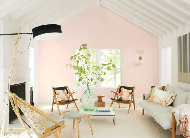
Living rooms are often the gateway to other areas of the home. “Neutral colors are a common and reliable choice for living rooms as they afford the opportunity to build a color scheme with furniture, carpeting, decor, and window treatments,” Jozefowicz says. “And since other rooms flow from the living room, a neutral color leaves the option of using a bolder color in the next room, drawing the eye through the main space.”
Conversely, if your furniture and carpeting is neutral, then you could use paint to create a defining mood in the living room. “Painting only one wall as an accent wall is an excellent way to make a splash without dominating the room,” Jozefowicz says. “Don’t forget to consider how much light the room gets. Well-lit rooms can benefit from strong colors that won’t risk getting washed out like paler shades.”
Bedroom
With the abundance of textiles like bedding, drapes, rugs, and throw pillows, bedrooms are a good place to create a color theme. “Choose a color for your bedroom that evokes the feeling you want to have in your private space,” Jozefowicz says. “Do you want to be invigorated or do you want to unwind?” Cool colors like pale blues and sage greens are popular in bedrooms because they create a calming, tranquil vibe, while warmer colors are a great choice if you want to energize the space.
Kitchen
Because your kitchen is dominated by other elements like cabinets, countertops, and appliances, you want to choose a wall color that complements them. “Soft finishes are a nice way to offset the hard surfaces of cabinets and countertops, but that doesn’t mean the colors have to be bland,” Jozefowicz advises. “Light colors provide a good balance to dark finishes on cabinets which are the dominant visual elements in any kitchen. However, don’t be afraid to choose a paint that will add a splash of color to neutral-tone cabinets.” Also consider that modern open-plan kitchens flow to and from other parts of the house, so choosing a color in the kitchen that complements the adjacent rooms creates a good visual segue.