Rustic Redo: A Hudson Valley Lakehouse Gets an Update
By Maria Ricapito | Photos by Deborah DeGraffenreid | Fall 2019 | Features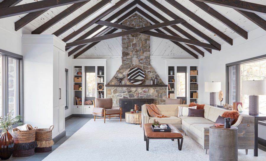
After renting a vacation cottage year-round for 10 years on Orange County’s Greenwood Lake, near Warwick, New York City couple Karen and Jim Thompson (not their real names) began thinking about creating a “family base” there—a place to gather with their two children and extended family for summer vacations, holidays, and ski weekends. “It had to be homey and accommodating for lots of different types of guests,” says Karen Thompson. In 2016, two neighboring properties came up for sale—one featuring a 1950s A-frame and a small cottage, and an adjacent property with a two-story, stone house built in the 1980s. The couple snapped both properties up, and began looking for a designer to renovate the stone house.
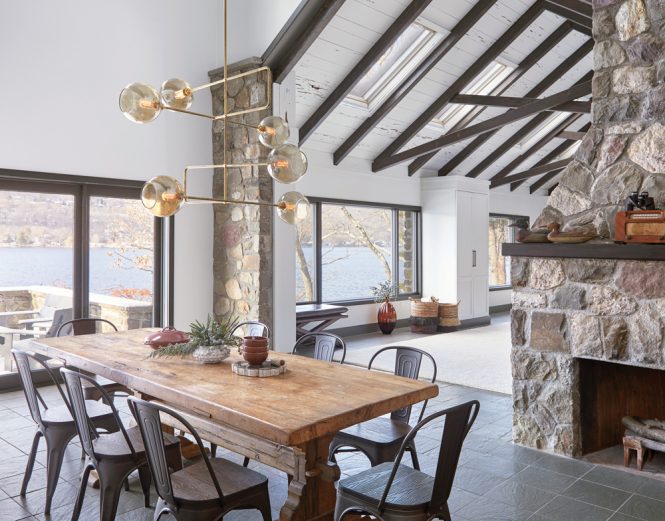
Tucked behind a second stone fireplace, the dining area features a long table purchased from the former owners, chairs from Wayfair, and a chandelier from Michele Varian.
Karen Thompson found Elizabeth Mercer, principal of Mercer Interior, based in New York City and Warwick, on Houzz. “We had strong aesthetic preferences from the start, but we needed guidance,” she says. “It was a complete redo of the look and feel of the space. ‘Rustic modern lake house’ was what we wanted.”
In its former incarnation, the 2,700-square-foot, two-story house was “very fussy and formal,” with “stuffy parlors,” says Mercer (who also refurnished the A-frame). “It was time for an update” in favor of a look that the designer describes as “modernized and comfy.” The house is located on the shore of the seven-mile lake, so nature led Mercer’s design. “I was inspired by the beautiful outdoors right outside the windows,” she says. “This house has its own dock, and visitors spend hours on the water.”

The family like to gather on the terrace overlooking the lake and a private dock, at a picnic table from Loll Designs.
Mercer maintained the house’s architectural footprint and other inherited features—beams, flooring, and windows—and chose a palette of charcoal and white for throughout the house, along with natural textures like petrified wood accessories, a driftwood feature wall, and stone mantels. She kept the existing slate flooring. “It keeps a feeling of flow, and it’s practical when you are coming in the house with wet feet,” she says. Other general touches include minimal window treatments and gray doors and molding. “I went for contrast,” Mercer says. “A lot of people do a light trim. I kept the moldings the same color throughout the house. It’s like the stitching in a piece of cloth.”
In the foyer, she added a graphic-patterned Hygge & West wallpaper, playing off the grid of the floor tiles and the recessed, box-tray ceiling, and installed a large brass lighting fixture from Restoration Hardware. Hooks line the wall, and a round mirror is hung over the sideboard from Room & Board.
Mercer’s motto is “texture on texture,” which she lets play out in the light-flooded living and dining area. The space is dominated by wooden beams and two massive stone fireplaces—one on the far wall of the living area and one facing the dining area. “They are so dramatic and needed to stand alone,” she explains. She painted the ceilings’ rough-hewn cedar planks white to contrast with the dark beams. “It kind of hurt me to paint over that,” she admits, “but it came out nice and makes for a nice, clean background.” A custom light fixture from Michele Varian cantilevers over the dining table. “It’s a moment for a bit of drama,” she says. “It’s evocative of the beams but doesn’t fight with them.”
Today, the living area is the family’s favorite part of the house, says Thompson. “It had wood paneling that wasn’t our taste. It was such a transformation,” she recalls. “We stayed away during construction and came in after the renovation and were like, ‘Wow!’ It felt like one of those remodel shows with a reveal. It’s dramatic, but not intimidating. It isn’t too pretty that you wouldn’t want to lie around. We watch movies and eat dinner and sit and talk. That was important to us, to be able to live life and not feel like we were at a hotel.”
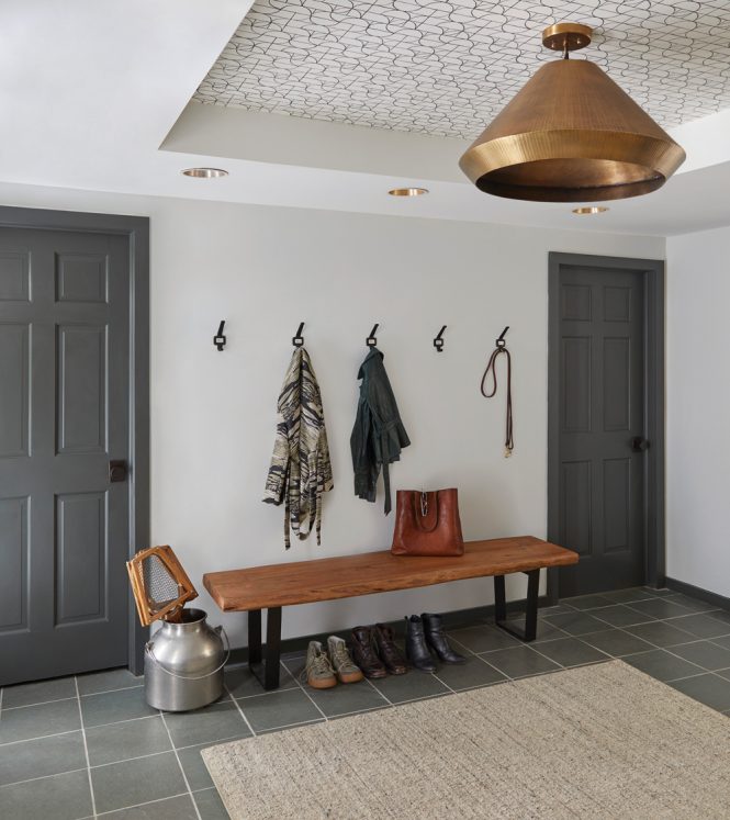
The foyer.
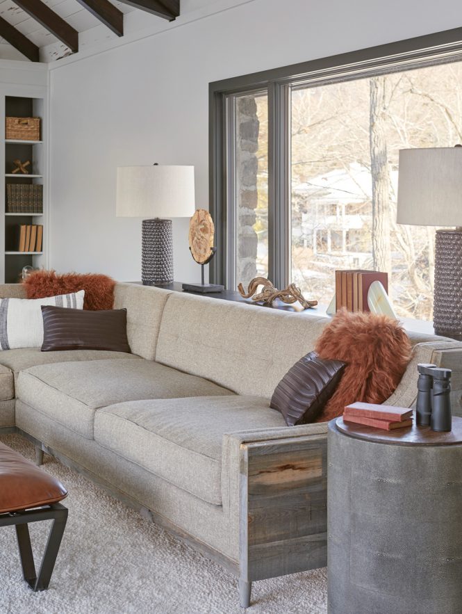
The living room’s furnishings, with luxe Arteriors lamps, Homegoods baskets, and a Crate & Barrel rug, are “a bit of a high-low mix,” Mercer says. When it came to budgeting for the furnishings, she says, “I gave as much bang for the buck as possible, picking pieces for maximum impact.” The couple bought the former owners’ dining table and added dining chairs from Wayfair. A custom couch with driftwood-like trim nods to the lakeside setting.
Originally, the house featured an upstairs, loft-style bedroom area that was open to the living area below, but Mercer added a wall to create a master suite and two smaller bedrooms. For the staircase, she replaced the original formal banisters and railing with a sleeker, tapered block version, which she painted charcoal. In the master bedroom, a large, nubby area rug adds softness to the slate. The owners kept the original bench niche, and Mercer reinforced it and recovered the cushion with Perennials fabric. “It makes a nice reading hangout,” she says. A Mitchell Gold & Bob Williams wall-hanging is positioned above the bed. In the guestroom, a Stikwood driftwood wall “brings the lake vibe in,” she says.
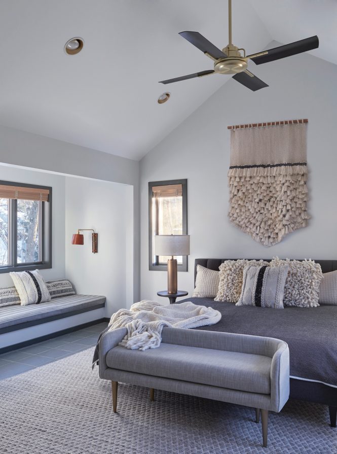
The upstairs master bedroom was a loft that provided little privacy, so Mercer built a wall and softened the room with a grey palette and neutral accents, including a nubby rug and a Mitchell Gold & Bob Williams wall hanging.
Back downstairs, the large TV screen is not a main focal point in the living room since this house is all about family. “Hopefully, a guest can have a conversation with another person,” says Mercer. Instead, the TV is stored in a media cabinet, along with the audio equipment, because sometimes togetherness means binge-watching on a rainy day.