Bold Move
How to Seamlessly Add Saturated Paint Colors to Your Home
Presented by Williams Lumber & Home Centers | Winter 2020 | SPONSORED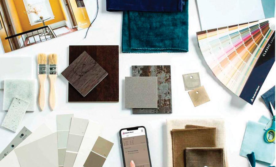
If you’ve ever let a catchy name sway your choice in paint color, you’re not alone. After all, that’s part of why they have names in the first place. Foggy Morning, Rosy Peach, Potters Clay—all paint names from Benjamin Moore—evoke a specific ambiance as much as a description of the color itself.
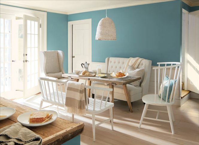
The name Aegean Teal evokes images of the Mediterranean, salt-scrubbed sailboats, and sunny summer days. The blue-green hue is as soothing as its name implies, which made it the perfect choice for Benjamin Moore’s 2021 color of the year.
“Amid uncertainty, people yearn for stability. The colors we surround ourselves with can have a powerful impact on our emotions and wellbeing,” says Andrea Magno, Benjamin Moore director of Color Marketing & Development.
With all the difficulties of the past year, the calming color is sure to appeal to many people as they take on indoor projects this winter. Venturing into bold, saturated colors like Aegean Teal, however, can be an intimidating step in anyone’s home design.
For a few tips on how to seamlessly incorporate bold paint color choices into your home, we turned to the pros at Williams Lumber and Home Centers, an authorized retailer of Benjamin Moore paints. With multiple locations, including two design centers in Pleasant Valley and Rhinebeck, Williams has been a go-to for home improvement in the Hudson Valley since 1946.
Select Your Space
Bold paint colors create a dramatic splash in any room, so it’s important to take time to think about the mood you want to cultivate in the space. Greens and blues are known for their soothing effects, while reds, oranges, and yellows can be more invigorating. Colors like magenta and purple can add a more artistic, creative vibe.
If you don’t already have your heart set on a color family, take a look at the surfaces and textures in your house. The color and warmth of hardwood floors, countertops, rugs, and furniture can help you determine which paint colors will coordinate best with what you already have and help narrow down your options.
Courtesy of Benjamin Moore
You can also use Benjamin Moore’s Color Portfolio app to visualize any of their colors in your existing space. “The app is great for comparing colors from the comfort of your home. After you’ve selected your perfect color, you can order the paint online and come pick it up at the store,” says Kim Williams, Williams’ Vice President of Retail Operations. “It’s a wonderful time-saver, especially when you want to travel less during the winter.”
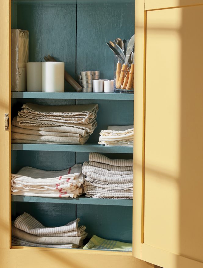
If the idea of painting a large room a bold color has you hesitating, a simple pop of color can also go a long way. Smaller spaces like a half bathroom, hallway, or alcove offer an easy opportunity to play with color without commiting to a major statement. You can also use saturated colors to add depth to the rest of your home’s color palette by painting interior doors, cabinets, and trim an unexpected hue.
Style It Your Own Way
The last thing you want is for a paint color you love to just not feel like you when the project is complete. Small details like paint finish, trim color, fixture materials, and wall texture can make a big impact on the paint’s final look.
Sheen, or paint finish, is a measure of how much light reflects off the paint—a surface effect that includes flat, matte, eggshell, satin, and gloss. A flat or matte finish can soften a bold paint because it absorbs more light, whereas a satin paint or high-gloss finish will draw your eye to the paint color as soon as you enter the room.
When it comes to trim colors, think outside classic white. White trim will make a bold-colored wall feel more crisp and traditional, but if you want to go for an edgier, artistic look, opt for a contrasting hue or monochromatic trim that matches the wall instead.
If the space you’re painting has a lot of hard fixtures like countertops, faucets, or knobs, consider swapping those out to level up your new paint selection. While your stainless steel faucets might have been a great match for your light blue kitchen, your new saturated walls can feel more modern with high-contrast fixtures in bronze, copper, black, and gold.
Courtesy of Benjamin Moore
New paint also doesn’t have to feel brand new. If you like a more lived-in aesthetic, you can try a technique known as color washing or glaze painting. Inspired by the heathered look of painted plaster, color washing walls is a decorative touch that gives any space a romantic, naturally aged look. Benjamin Moore has a latex glaze made for mixing directly with a darker paint color of your choice that you can apply over a lighter base coat with a brush, rag, or sponge to achieve this stylish textural effect.